The Art of Choosing Paint Colors: How to Pick the Perfect Shade for Every Room
Choosing the right paint color can transform your space, setting the tone and mood of each room. But with countless options available, picking the perfect shade can be overwhelming. In this guide, we’ll walk you through the art of choosing paint colors and how to select the ideal hue for every room in your home.
1. Understand the Mood and Purpose of the Room
Before you start browsing paint swatches, consider the mood you want to create in each room. The color you choose should align with the room’s purpose and how you want to feel when you’re in it.
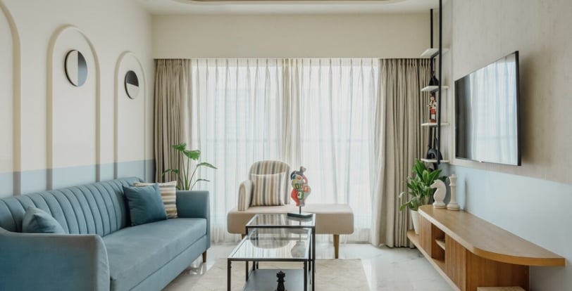
- Living Room: This is often the central hub of your home, where you entertain guests and relax with family. Warm, inviting colors like soft grays, beiges, and muted greens can create a cozy atmosphere. For a more vibrant and social space, consider deeper tones like navy blue or a rich terracotta.
- Bedroom: Your bedroom is your personal retreat, so choose colors that promote relaxation and tranquility. Soft, cool colors like pale blues, lavenders, and light grays are ideal for creating a peaceful environment. If you prefer something warmer, opt for soft pinks or warm neutrals.
- Kitchen: Kitchens are often the heart of the home, bustling with activity. Bright, energizing colors like yellow, soft greens, or light blues can make the space feel lively and fresh. Neutral tones like white or cream are timeless and can easily be paired with colorful accessories.
- Bathroom: For a spa-like feel, choose soothing colors such as seafoam green, light blue, or soft gray. These shades evoke a sense of cleanliness and calm. If you prefer a more dramatic look, dark colors like charcoal or deep navy can add sophistication.
- Home Office: Your workspace should inspire productivity and focus. Light, neutral colors like soft gray, white, or pale green can help you concentrate. Avoid overly bright or bold colors that might be distracting.
2. Consider Lighting Conditions
Lighting plays a crucial role in how paint colors appear in your home. A color that looks perfect in the store might look entirely different once you get it on your walls.
- Natural Light: Rooms with plenty of natural light can handle a wider range of colors, including darker or more saturated hues. North-facing rooms may have cooler light, making colors appear more blue or gray, while south-facing rooms get warmer light, which can make colors look more yellow or red.
- Artificial Light: Pay attention to the type of artificial lighting in each room. Incandescent bulbs cast a warm, yellow light that enhances reds and oranges but dulls blues and greens. Fluorescent lights give off a cooler, blue-toned light that can make warm colors appear more muted. LED lights come in various color temperatures, so choose bulbs that complement your paint choice.
- Test the Colors: Before committing to a color, test it on your walls. Paint a small section in different areas of the room and observe how it looks at different times of day and under different lighting conditions.
3. Start with a Neutral Base
Neutrals are versatile and can be the perfect foundation for your home’s color palette. They provide a calm backdrop that allows other design elements to shine, making them ideal for any room.
- White: White walls create a clean, crisp look and make a room feel larger and more open. It’s a classic choice that works well in modern, minimalist, and traditional spaces alike. Consider different shades of white, from bright white to warm off-whites, depending on the room’s lighting and style.
- Gray: Gray is a popular neutral that comes in a wide range of shades, from cool to warm tones. Light gray can add a soft, elegant touch to a room, while darker grays bring depth and sophistication.
- Beige: Beige and other warm neutrals like taupe and cream create a cozy and inviting atmosphere. These colors are perfect for living rooms, bedrooms, and spaces where you want to encourage relaxation.
4. Incorporate Accent Colors
Once you’ve chosen a base color, consider incorporating accent colors to add personality and interest to your space. Accent colors can be used on an accent wall, in furnishings, or through decor and accessories.
- Complementary Colors: Choose accent colors that are opposite your base color on the color wheel. For example, if your walls are blue, accents in warm colors like orange or red can create a striking contrast.
- Monochromatic Scheme: Stick with varying shades of the same color for a cohesive and serene look. This works well in bedrooms and bathrooms, where a calming environment is desired.
- Analogous Colors: Select colors that are next to each other on the color wheel, such as blue and green or yellow and orange. This creates a harmonious and visually pleasing palette.
5. Consider the Flow Between Rooms
When choosing paint colors, think about how they will flow from one room to the next. The transition between rooms should feel natural and cohesive.
- Open Floor Plans: In homes with open floor plans, it’s important to maintain a consistent color palette to avoid a disjointed look. Choose colors that complement each other and create a sense of unity.
- Adjacent Rooms: When transitioning between rooms, consider how the colors will look together. For example, if your living room is painted a soft gray, a light blue in the adjoining dining room can create a seamless flow.
- Hallways and Entryways: These spaces often connect different rooms and should set the tone for the rest of the house. Neutrals or light colors work well in these areas, allowing for smooth transitions between more vibrant or distinct color choices in other rooms.
6. Use Color to Highlight Architectural Features
Paint can be used strategically to highlight architectural details in your home, such as molding, trim, or built-in features.
- Contrast Trim: Painting trim and molding in a contrasting color can make these features stand out. For a classic look, paint trim in a crisp white against a colored wall. For something bolder, consider dark trim with light walls.
- Feature Walls: Create a focal point by painting one wall in a bold or contrasting color. This can work especially well behind a bed, sofa, or in a dining room.
- Ceilings: Don’t forget the fifth wall! Painting the ceiling a different color can add depth and interest to a room. For a dramatic effect, try a dark ceiling paired with lighter walls, or a soft, pastel color to add a touch of whimsy.
7. Trust Your Instincts and Personal Style
Ultimately, the best paint color is the one that feels right to you. While it’s helpful to follow design principles and consider expert advice, your home should reflect your personal style and preferences.
- Mood Boards: Create a mood board with your favorite colors, fabrics, and decor items to see how they work together. This can help you visualize the overall look and feel of your space.
- Personal Touch: Don’t be afraid to take risks with color. If you love a bold shade, find a way to incorporate it into your home, whether through an accent wall, a piece of furniture, or accessories.
- Evolve Over Time: Your tastes and needs may change, and that’s okay! Paint is one of the easiest and most affordable ways to update your home, so feel free to experiment and refresh your space as needed.
Choosing the perfect paint color for every room is an art that combines color theory, personal style, and the unique characteristics of your home. By understanding the mood you want to create, considering lighting and flow, and using paint to highlight architectural features, you can select colors that transform your space into a harmonious and inviting retreat. Trust your instincts, take your time, and enjoy the process of bringing your vision to life.
For more design tips and inspiration, be sure to subscribe to our blog and follow us on social media!